Creating a reusable Step Wizard with React and Chakra UI

Brandon Connors
April 29th, 2023
The repository with example code can be found at
https://github.com/bdconnors/step-wizard-example
Introduction
A Step Wizard simplifies complex multi-step forms or processes by breaking them down into smaller steps. It also keeps track of progress and provides a visual indicator to help guide the user through each step.
In this article, we will be building a Step Wizard component using React and Chakra UI. If you're not familiar with Chakra UI, it is a highly flexible React component library that comes with numerous useful features out of the box.
Setup
The example code was done within a Next.js app but it will work with any project using React.
1. Create a new Next.js 13 Project
npx create-next-app@latestYou will be prompted for a few things, just be sure to choose TypeScript and to use the App Router.
2. Install Chakra UI and its dependencies in your project folder
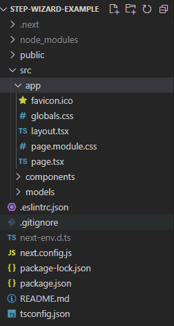
npm i @chakra-ui/react @emotion/react @emotion/styled framer-motion3. Add a components folder and a models folder inside the src directory.
Your folder structure should now look like this:
4. Run npm run dev to start the app on http://localhost:3000
Components
Now that we have our project setup we can start adding our components. The first thing that we are going to need is a model for our steps.
Now that we have our project set up, we can begin adding our components. The first requirement is to have a model for our steps.
Create a StepModel.ts file in the models folder. It should contain the following code:
export interface StepModel {
 title: string,
 description: string,
 component: JSX.Element //the component to display
}
Next, we need a tracker to indicate the progress made in our multi-step process. There are several approaches to this, but in this article, we will only cover a couple of them
Step Tracker

A Step Tracker tracks each step individually and can be displayed vertically or horizontally.
Create a StepTracker.tsx file in the components folder. It should contain the following code:
"use client";
import { StepModel } from "@/models/StepModel";
import { Box, Step, StepDescription, StepIcon, StepIndicator, StepNumber, Stepper, StepSeparator, StepStatus, StepTitle } from "@chakra-ui/react"
export interface StepTrackerProps {
steps: StepModel[],
active: number,
size?: 'sm' | 'md' | 'lg',
orientation?: 'horizontal' | 'vertical',
colorScheme?: string,
height?: string
}
export const StepTracker = (props: StepTrackerProps) => {
const { steps, active, size = 'lg', orientation = 'horizontal', height, colorScheme } = props;
return (
<Stepper
index={active}
size={size}
orientation={orientation}
height={height}
colorScheme={colorScheme}
>
{steps.map((step, index) => (
<Step key={index}>
<StepIndicator>
<StepStatus
complete={<StepIcon />}
incomplete={<StepNumber />}
active={<StepNumber />}
/>
</StepIndicator>
<Box flexShrink='0'>
<StepTitle>{step.title}</StepTitle>
<StepDescription>{step.description}</StepDescription>
</Box>
<StepSeparator />
</Step>
))}
</Stepper>
)
}
The required props for StepWizard include an array of StepModel and the active step index. These props enable us to display the title, description, and status of each step. Optional props for StepWizard include size, orientation, height, and color scheme (with a default of blue). The useSteps hook controls and updates the status of each step, which will be utilized in our StepWizard component
Percent Tracker
The second tracker is less sophisticated and tracks progress with a solid bar and percentage label.
Create a PercentTracker.tsx file in the components folder. It should contain the following:
"use client";
import { Box, Center, HStack, Progress, Stack, useBreakpointValue, Text } from "@chakra-ui/react";
export interface PercentTrackerProps {
colorScheme?: string,
active: number,
total: number
}
export const PercentTracker = (props: PercentTrackerProps) => {
const { colorScheme = 'blue', active, total } = props; //default to blue if no value provided
//scale bar to fit screen size
const barWidth = useBreakpointValue({
base: '15em',
sm: '15em',
md: '30em',
lg: '55em',
xl: '55em'
});
const progress = Math.round((active / total) * 100);
return (
<Stack direction="column" pb={4}>
<Center>
<HStack>
<Box px={0}>
<Progress
value={progress}
borderRadius={12}
h="1em"
w={barWidth}
colorScheme={colorScheme}
/>
</Box>
<Text fontWeight='semibold'>{ `${progress}%` }</Text>
</HStack>
</Center>
</Stack>
);
}
The required props for the StepProgressBar component are the active step index and the total number of steps. These props enable us to calculate the completion percentage. Additionally, there is an optional prop called color scheme, which allows for changing the color of the progress bar (with a default value of blue). To ensure responsiveness, we have included the useBreakpointValue hook, which dynamically scales the width of the progress bar based on the client's screen size
Step Wizard
Our StepWizard acts as the driver for a multi-step process. It requires an array of StepModel as a prop and contains our tracker, which can be changed via the tracker prop (default is StepTracker). The useSteps hook controls the state by providing the active step index and functions to move steps forward and backward.
"use client";
import { Button, HStack, Stack, useSteps, VStack } from "@chakra-ui/react"
import { StepTracker } from "./StepTracker"
import { PercentTracker } from "./PercentTracker";
import { StepModel } from "@/models/StepModel";
export interface StepWizardProps {
tracker?: 'steps' | 'percent',
orientation?: 'horizontal' | 'vertical',
colorScheme?: 'red' | 'orange' | 'yellow' | 'green' | 'blue',
steps: StepModel[]
}
export const StepWizard = (props: StepWizardProps) => {
const { tracker = 'steps', orientation = 'horizontal', colorScheme = 'blue', steps } = props;
const { activeStep, goToPrevious, goToNext } = useSteps({ index: 0, count: steps.length });
return (
<Stack
spacing={4}
direction={orientation === 'vertical' ? 'row' : 'column'}
>
{ tracker === 'steps' &&
<StepTracker
steps={steps}
active={activeStep}
orientation={orientation}
height={orientation === 'vertical' ? '400px' : undefined} // if vertical set a height value
colorScheme={colorScheme}
/>
}
{ tracker === 'percent' &&
<PercentTracker
active={activeStep}
total={steps.length}
colorScheme={colorScheme}
/>
}
<VStack direction={'column'}>
{ steps[activeStep] && steps[activeStep].component}
<HStack>
<Button colorScheme={'blue'} variant='outline' onClick={()=>goToPrevious()}>Prev</Button>
<Button colorScheme={'blue'} variant='outline' onClick={()=>goToNext()}>Next</Button>
</HStack>
</VStack>
</Stack>
)
}
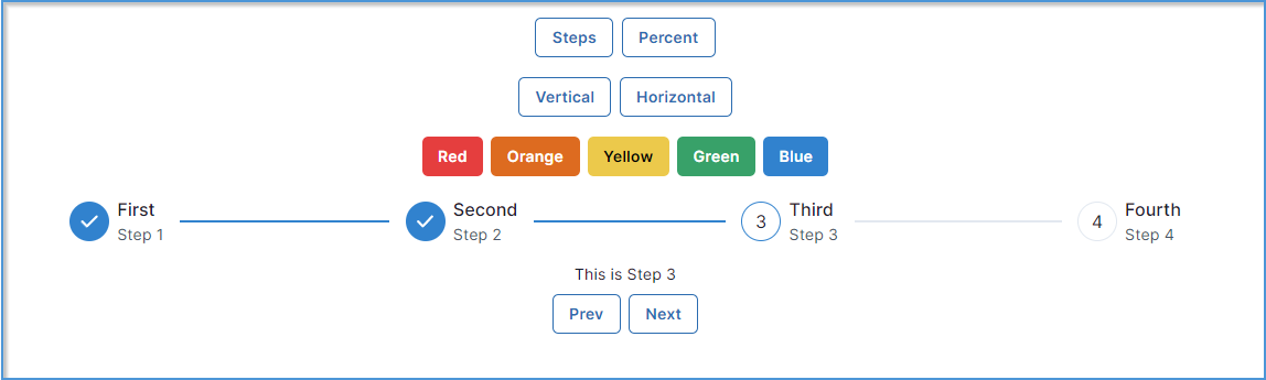
Now that we've built our components lets test them out!
Putting It All Together
"use client";
import { StepWizard } from "@/components/StepWizard";
import { StepModel } from "@/models/StepModel";
import { Button, ChakraProvider, Container, HStack, VStack } from "@chakra-ui/react";
import { useState } from "react";
interface StepWizardDemoState {
tracker: 'steps' | 'percent',
orientation: 'horizontal' | 'vertical',
colorScheme: 'red' | 'orange' | 'yellow' | 'green' | 'blue'
}
export default function Home() {
const steps: StepModel [] = [
{ title: 'First', description: 'Step 1', component: <h1>This is Step 1</h1> },
{ title: 'Second', description: 'Step 2', component: <h1>This is Step 2</h1> },
{ title: 'Third', description: 'Step 3', component: <h1>This is Step 3</h1> },
{ title: 'Fourth', description: 'Step 4', component: <h1>This is Step 4</h1> }
];
const [state, setState] = useState<StepWizardDemoState>({
tracker: 'steps',
orientation: 'horizontal',
colorScheme: 'blue'
});
const setTracker = (tracker: 'steps' | 'percent') => setState({
...state,
tracker: tracker,
orientation: 'horizontal'
});
const setOrientation = (orientation: 'horizontal' | 'vertical') => setState({
...state,
tracker: 'steps',
orientation: orientation
});
const setColorScheme = (colorScheme: 'red' | 'orange' | 'yellow' | 'green' | 'blue') => setState({
...state,
colorScheme: colorScheme
});
return (
<ChakraProvider>
<Container maxW={'6xl'} >
<VStack py={5} spacing={5}>
<HStack>
<Button colorScheme={'blue'} variant='outline' onClick={()=>setTracker('steps')}>Steps</Button>
<Button colorScheme={'blue'} variant='outline' onClick={()=>setTracker('percent')}>Percent</Button>
</HStack>
{ state.tracker === 'steps' &&
<HStack>
<Button colorScheme={'blue'} variant='outline' onClick={()=>setOrientation('vertical')}>Vertical</Button>
<Button colorScheme={'blue'} variant='outline' onClick={()=>setOrientation('horizontal')}>Horizontal</Button>
</HStack>
}
<HStack>
<Button colorScheme='red' onClick={()=>setColorScheme('red')}>Red</Button>
<Button colorScheme='orange' onClick={()=>setColorScheme('orange')}>Orange</Button>
<Button colorScheme='yellow' onClick={()=>setColorScheme('yellow')}>Yellow</Button>
<Button colorScheme='green' onClick={()=>setColorScheme('green')}>Green</Button>
<Button colorScheme='blue' onClick={()=>setColorScheme('blue')}>Blue</Button>
</HStack>
</VStack>
<StepWizard steps={steps} tracker={state.tracker} orientation={state.orientation} colorScheme={state.colorScheme}/>
</Container>
</ChakraProvider>
);
}